Table of Contents
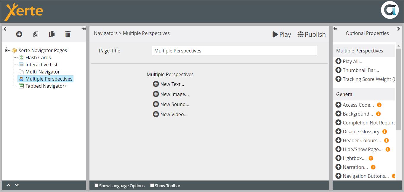
Navigator > Multiple Perspectives
This page presents a series of thumbnails which, when clicked on, open nested pages. There are 4 options for these nested pages, focusing on text, an image, an audio recording or a video recording. While you can embed a link to video hosted elsewhere onto any page in Xerte, this is one of the few page types where the default is to upload the video into Xerte. 
Example demo
or view at Xerte Page Types > Navigators: Multiple Perspectives (opens in new tab).
Editor Interface
Top Level: Core Properties
| Property | Description | Type | Additional information |
|---|---|---|---|
| Page Title | Text that appears in header of published page. | Text |
Top Level: Optional Properties
Page-specific
| Property | Description | Type | Additional information |
|---|---|---|---|
| Play All: Include Play All Button | Inserts a Play All thumbnail at the beginning of the thumb nail bar. | Tick box | |
| Play All: Image Play time | The number of seconds a nested image page remains visible if Play All is applied. | Number | |
| Thumbnail Bar: Position | The position of the Thumbnail Bar on the page {Top/Bottom/Grid}. | Drop-down |  New in 3.13. When set to Grid, a new Display In property can be set to allow the content for each item to be opened in a lightbox rather than on the page itself. New in 3.13. When set to Grid, a new Display In property can be set to allow the content for each item to be opened in a lightbox rather than on the page itself. |
| Thumbnail Bar: Height | The height of the Thumbnail Bar (Small/Medium/Large}. | Drop-down | Choose Large if the titles of your nested pages are 15 - 20 characters |
| Thumbnail Bar: Type | Choose what is included in the Thumbnail Bar {Image and Caption/Image and Number/Image Only}. | Drop-down | The Caption is the Title of the nested page. If you choose Image and Number, numbers are automatically assigned. |
| Thumbnail Bar: Border | Displays a thin black border round each thumbnail. | Tick box | |
| Thumbnail Bar: Highlight Current | Check this box if you want to change the default (yellow) colour of the thumbnail for the current nested page… | Tick box | |
| Thumbnail Bar: Highlight Colour | … and choose a colour here. | Colour picker | If you want a different colour highlight, add the colour here, and make sure the Highlight Current check box is ticked. |
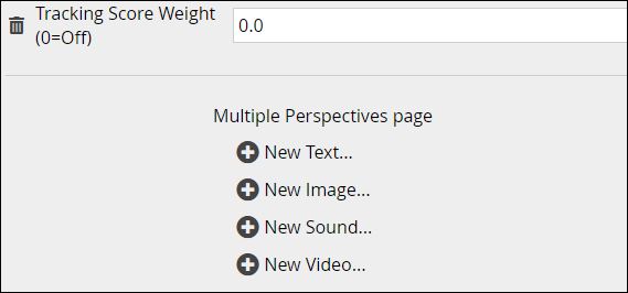
| Tracking Score Weight (0=Off) | Allows the task on the page to be weighted relative to other scored pages in the project. | Number | Add link to weighting page. |
General
Top Level: Language Options
| Property | Description | Type | Additional information |
|---|---|---|---|
| Scroll Back Tip | The text for the tooltip that appears on mouseover of the Forward button - this button is only displayed when the thumbnail bar at the top has too many items to show at once. | Text | Default - “Scroll Back” |
| Scroll Forward Tip | The text for the tooltip that appears on mouseover of the Back button - this button is only displayed when the thumbnail bar at the top has too many items to show at once. | Text | Default - “Scroll Back” |
| Generic Video Tip | When you add a video clip but don't upload an associated image, a default image will show. This is the alt text for that image. | Text | Default - “Video Clip” |
| Generic Sound Tip | When you add an audio clip but don't upload an associated image, a default image will show. This is the alt text for that image. | Text | Default - “Sound Clip” |
| Back Button Text | When thumbnail bar position is set to grid and you view one of the items, you see a back button to return to the grid view. This is the text on that button. | Text | Default - “Back” |
| Play All Text | If you have added a Play All thumbnail from Optional Properties, this is the text that appears in the thumbnail. | Text | Default - “Play All” |
After you have given the page a Title and looked at the Optional Properties and Language Options, you need to add content. You have 4 Options;
Follow these links to see their properties;


