Table of Contents
Navigator > Multinavigator
This page provides 5 options for organising information on a page. When learners click on an item it brings up content (text, images etc.) in the right-hand panel. When they click on another item in the list, the content is replaced with new content.
The content and clickable items are inputted in the same way for all 5 options, so you only have to do this once, and then you can experiment and decide on the most appropriate format afterwards.
Example demo
This demo shows the (default) Tabs option, but this, and examples of the other 4 options, can also be opened in new tabs through the links below the demo. All the demos have the same content.
Editor Interface
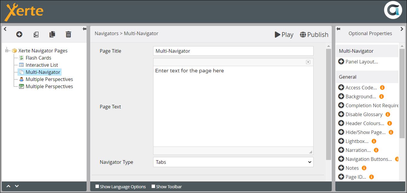
Top Level: Core Properties
| Property | Description | Type | Additional information |
|---|---|---|---|
| Page Title | Text that appears in header of published page. | Text | |
| Page Text | Content that appears at the top of the left-hand panel, above the clickable items. | Text+ (Toolbar) | Use this to give the context or instructions for the task. Other content (e.g. images, audio, video) can be embedded here. |
| Navigator Type | Select the format for the page.{Accordion/Buttons/Columns/Slideshow/Tabs} | Drop-down |
Top Level: Optional Properties
Page-specific
There are 5 options relating to Panel Layout.
| Property | Description | Type | Additional information |
|---|---|---|---|
| Panel Width | The size of the panel in which the nested page content is displayed. {Small/Medium/Large/Full} | Drop-down | |
| Panel Height | This panel can either fill the window, or adjust to the. {Fill Space/Fit Content} | Drop-down | |
| Panel Position | The position of the panel displaying the nested page content. {Left/Right} | Drop-down | |
| Button Position | This property only applies to the Multi-Navigator: Button format, The position of the buttons relative to the content. {Top/Bottom} | Drop-down | |
| Collapse Accordion | If you check this box, the whole accordion is collapsed. Otherwise, the content for the first item is displayed when the learner lands on the page. | Tick box |
General
Top Level: Language Options
These relate to the Slideshow format only.
| Property | Description | Type | Additional information |
|---|---|---|---|
| Slideshow Button Tip (Next) | Text that appears on mouseover of the forward icon. | Text | Default - “Next” |
| Slideshow Button Tip (Previous) | Text that appears on mouseover of the back icon. | Text+ (Toolbar) | Default - “Previous” |
| Slide {i} of {n} | Indicates which slide the learner is viewing. | Drop-down | Default - “Slide {i} of {n}” |
After you have created the settings and inputted the Page Title and Page Text, you need to add the content. If you have not yet decided on the most suitable format, you will probably need to come back and alter the settings. Click on New Nested Page.
New Nested Page: Core Properties
| Property | Description | Type | Tooltip |
|---|---|---|---|
| Title | The text that appears on each Button or Tab, on the Accordion “folds”, at the top each Column, or at the top of each Slide. | Text | |
| Text | The content that appears when you click on a Button, Tab or Accordion fold, or is displayed in the Columns or on each Slide. | Text+ (Toolbar) | Can be text, image, audio, video etc. |
You can also add Media as an Optional Property. You can, of course, add an image through the Text Editor, but it may display better if you add it as an Optional Property. You also prompted to add a Description for Accessibility.
Further information
The Accordion format may work well if you want to create FAQs, because longish questions will probably display better than in Buttons or Tabs for example.


