

- Posts: 17
- Thank you received: 0
Report any technical problems you discover and discuss solutions.
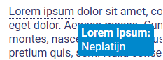
Glossary - backgroundcolor Info bubble
- Martens
-
 Topic Author
- Offline
- New Member
-

Less
More
11 months 6 days ago #9627
by Martens
Glossary - backgroundcolor Info bubble was created by Martens
If you create a glossary, you can display the meaning of a word in a info bubble when hovering over it.
How can I change the background color of the bubble? What is the CSS code for this?
How can I change the background color of the bubble? What is the CSS code for this?
Please Log in or Create an account to join the conversation.
- tom
-

- Offline
- Administrator
-

Less
More
- Posts: 1365
- Thank you received: 344
11 months 5 days ago #9628
by tom
Replied by tom on topic Glossary - backgroundcolor Info bubble
The hover itself has id x_glossaryHover but the colors are set on the class x_tooltip by default. So this should do the trick:
.x_tooltip {
border: 1px solid #937184;
background-color: #937184;
}
.x_tooltip {
border: 1px solid #937184;
background-color: #937184;
}
Please Log in or Create an account to join the conversation.
- Martens
-
Topic Author
- Offline
- New Member
-
Less
More
- Posts: 17
- Thank you received: 0
10 months 4 weeks ago #9633
by Martens
Replied by Martens on topic Glossary - backgroundcolor Info bubble
It is not working. I've tried adding !important, but it still doesn't work.
.x_tooltip {
border: 1px solid #937184 !important;
background-color: #937184 !important;
}
.x_tooltip {
border: 1px solid #937184 !important;
background-color: #937184 !important;
}
Please Log in or Create an account to join the conversation.
- tom
-
- Offline
- Administrator
-
Less
More
- Posts: 1365
- Thank you received: 344
10 months 4 weeks ago #9635
by tom
Replied by tom on topic Glossary - backgroundcolor Info bubble
A question that I should have started wit, is this in the Nottingham/xot template or the bootstrap? The example should work for Nottingham/xot.
Please Log in or Create an account to join the conversation.
- Martens
-
Topic Author
- Offline
- New Member
-
Less
More
- Posts: 17
- Thank you received: 0
10 months 4 weeks ago #9636
by Martens
Replied by Martens on topic Glossary - backgroundcolor Info bubble
Bootstrap 
Please Log in or Create an account to join the conversation.
- tom
-
- Offline
- Administrator
-
Less
More
- Posts: 1365
- Thank you received: 344
10 months 4 weeks ago #9638
by tom
Replied by tom on topic Glossary - backgroundcolor Info bubble
Ok then
You can use
.glossaryTip {
border: 1px solid #937184;
background-color: #937184;
}
You can use
.glossaryTip {
border: 1px solid #937184;
background-color: #937184;
}
The following user(s) said Thank You: Martens
Please Log in or Create an account to join the conversation.
Moderators: ronm, julten, JohnSmith
Time to create page: 0.132 seconds