Supporting each other

Community forums

Welcome, Guest
Username: Password: Remember me
Report any technical problems you discover and discuss solutions.
  • Page:
  • 1

TOPIC:

Dragging issues with Gap Fill slide type 5 years 1 month ago #5973

  • Wullie
  • Wullie's Avatar Topic Author
  • Offline
  • New Member
  • New Member
  • Posts: 4
  • Thank you received: 0
Hi,

One of our content creators has made a Gap fill slide, with 7 gaps and numerous distractors (probably too many, but that won't resolve the issue).
The text covers the fullness of the screen (on normal sized view) and the answers need to be scrolled to.
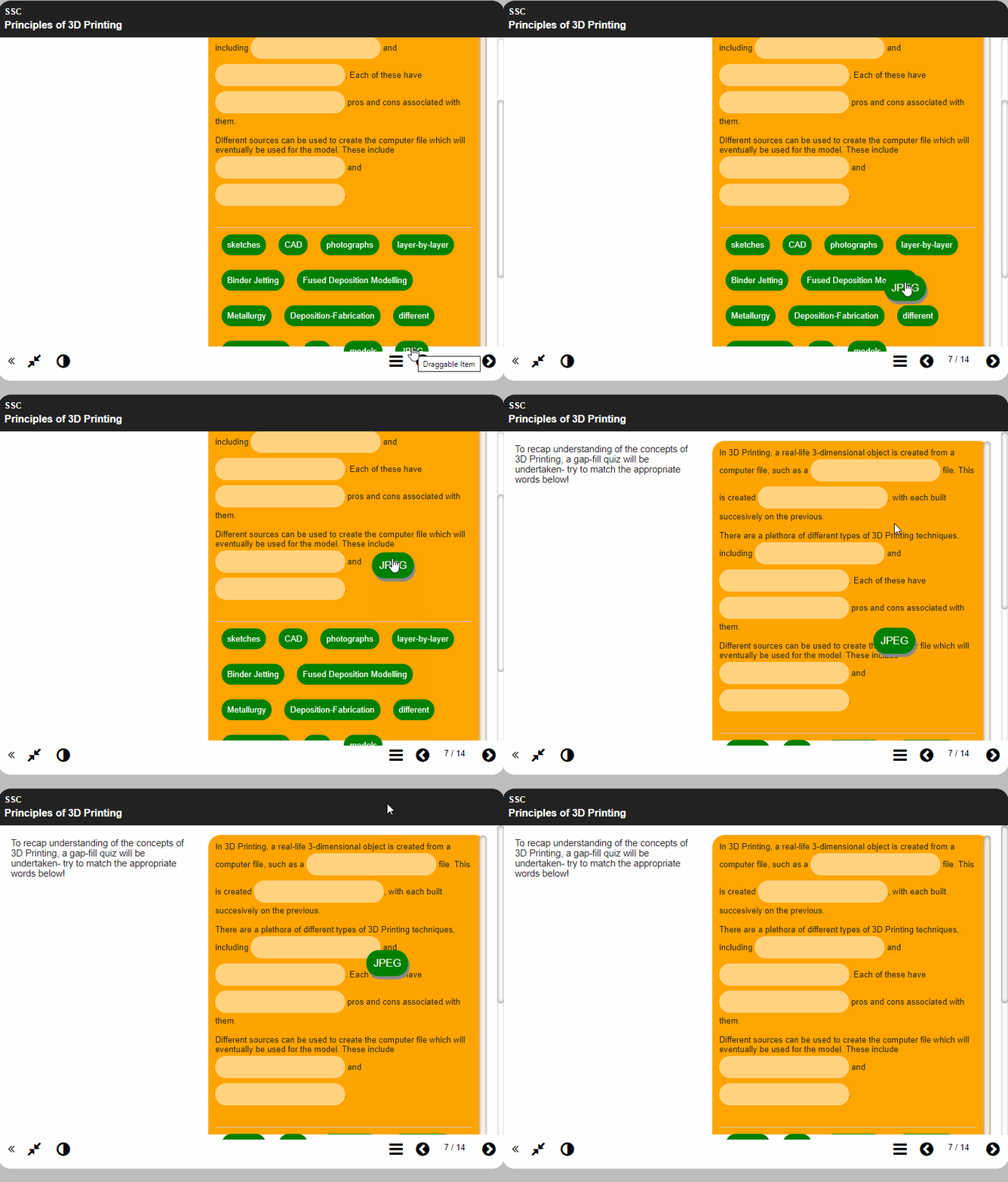
When you scroll to the correct answer for the first gap, which usually appears at or near the bottom, and have to scroll with the mousewheel back up to the top, the dragged answer never reaches anywhere near the first gap (as per the attached gif).

Is this a known issue and is there anything that can be done to resolve this issue?
Attachments:

Please Log in or Create an account to join the conversation.

Dragging issues with Gap Fill slide type 5 years 1 month ago #5974

  • xlearn
  • xlearn's Avatar
  • Offline
  • Junior Member
  • Junior Member
  • Posts: 24
  • Thank you received: 3
Hi there
Would it change things very much for you if you changed the interaction to a drop-down list instead? This makes it more accessible in many ways. It's easier to use on mobile, and works better for any screen readers.
You can use a drop down to change it from 'drag and drop' to 'drop down menu', which makes it easy to just try this out.
Making the Panel Width large may also reduce the scrolling needed.
Regards
Lilian

Please Log in or Create an account to join the conversation.

Last edit: by xlearn.

Dragging issues with Gap Fill slide type 5 years 1 month ago #5977

  • ronm
  • ronm's Avatar
  • Offline
  • Administrator
  • Administrator
  • Posts: 852
  • Thank you received: 261
Hi
as Lilian has suggested the first thing I would do is set the panel width property to large so that it's wider but still enough room for your current instructions. Although on a smartphone sized device the panel will fill the width regardless of this setting.
You could then try the following:
1. add an optional script property to the page and add the following script:
//move the labels above the targets
$("#labelHolder").insertBefore("#targetHolder");
The above should move the labels above the text and targets.
2. Add an optional styles property to the page and use some css to reduce the margins and padding e.g.
.x_gapFill_page #labelHolder .label {
    padding: 5px;
    margin: 5px;
}
.x_gapFill_page #targetHolder .highlight {
    padding: 5px;
    margin: 2px;
}
.x_gapFill_page #targetHolder .target {
    padding: 2px !important;
    height: 26px !important;
}
Note: the sizes I've used there seems to work ok with the RGBO theme which it looks like you are using but may need to be varied for other themes.
Let us know if that works?
HTH
Ron
Xerte developer & trainer
e-learning & m-learning consultant
mitchellmedia.co.uk | xerteacademy.com | learningapps.co.uk
Note: Support here is voluntary and meant for users to support each other.
Need direct commercial support with Xerte? mitchellmedia.co.uk/contact/

Please Log in or Create an account to join the conversation.

Last edit: by ronm.
  • Page:
  • 1
Moderators: ronmjultenJohnSmith
Time to create page: 0.119 seconds
Copyright © 2024 The Xerte Project.
Xerte logo Apereo logo OSI Logo

Search