This is an old revision of the document!
Table of Contents
Bootstrap
The Bootstrap Template enables you to create a simple website, which you could use, for example, to organise and present learning materials for a course or course module. If you are able to author a range of page types using Xerte Online Toolkit (XOT), then using the Bootstrap Template should be fairly easy, as many of the basic principles are the same. Many of the resources created by the Xerte community have been produced using the Bootstrap Template.
Example demo
This Introduction to Bootstrap site was created using the Bootstrap Template. It has a simple design (and there is a lot more you can do round design, for example of the header), but it also provides a comprehensive guide to the functionality of the Bootstrap Template. In this wiki, this site displays much as it would on a smartphone. If you open it in a new tab (see below) it will display differently.
or view at Introduction to Bootstrap (opens in new tab)
Bootstrap Structure
A Bootstrap project comprises Pages and Sections within those pages. A project can consist of only one Page, if that is all that is needed.
 A Page Title will appear as either;
- a tab below the header (on large screens)
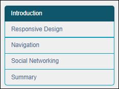
 A Section Title will appear as an item in a menu that displays either;
- on the left side of the screen (on larger screens)
- or at the top of the screen (on smaller screens).
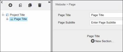
 When you start creating your Bootstrap project, you will see that the first page is in place. You need to give a Page Title, and (optionally) a Page Subtitle. These are displayed in the header for the page.
Page: Optional Properties
| Property | Sub-property | Description | Type | Additional information |
| Access | Access Code(s) | A code that allows the learner to access this section | Text | Separate codes with a comma if you want multiple codes |
| Case Sensitive | Tick this box if you want the code(s) to be case sensitive | Tick box | ||
| Instructions | An instruction displayed above the Access Code text-entry box | Text+ (Toolbar) | Default - “Enter an access code below to view this section:” | |
| Error Message | Error message displayed if the learner inputs the wrong Access Code | Text+ (Toolbar) | Default - “Invalid Access Code” | |
| Button Label | Text on the button for submitting Access Code | Text | Default - “Submit” | |
| Filter Categories | Has to be used in conjunction with Search from the project-level Optional Properties. The Search categories must be set up first, as the filter categories for this section are ticked from this list. | Tick boxes | ||
| Header… | Image | Upload any image that you want to include in the header, through Media Browser | Link to Media Browser | You do not have to include an image in the header. |
| Image Position | The position of the image within the header {Left/Centre/Right} | Drop-down | ||
| Image Repeat | If your image is not the same proportions as the header, you can have it repeat to fill the space {Horizontal and Vertical Repeat / Horizontal Repeat / Vertical Repeat / No Repeat } | Drop-down | ||
| Title Position | The position of the Page Title and Page Subtitle in the header {Right/Centre/Left} | Drop-down | ||
| Background colour | Colour of the header background | Colour Picker | ||
| Text Colour | Colour of the Page Title and Page Subtitle text | Colour picker | ||
| Banner | You can either fix the height of the header, or have it fill the whole screen when the learner lands on it {Fixed Height/Full Screen} | Drop-down | If you choose Full Screen, 3 more sub-properties appear: Title top margin (%) sets the position of the Page Title and Page Subtitle relative to the top of the banner; Collapse Banner collapses the banner when the learner starts scrolling down the page (recommended); Enable scroll down info prompts the learner to scroll down to see the menu and page content | |
| Fixed height | If you have chosen Fixed Height as the Banner property (see row above) ticking the box allows you set a specific height, and leaving it unticked sets a fixed height large enough to display the Page Title and the Page Subtitle | Tick box | If you tick this box, an sub-property Banner Height appears, in which you can set the banner height | |
| Hide/Show Page… | Hide Page | Use this tick box to hide the Page | Tick box | If you want the Section to be hidden at all times, use this tick box and don't add dates/times in the fields below |
| From | Enter a date here, if you want the Page to be hidden from a specific date | Date picker | Use in conjunction with Hide Page tick box | |
| From (hh:mm) | Enter the time relating to the date above | Number | Use in conjunction with Hide Page tick box | |
| Until | Enter a date here, if you want the Page to be hidden until a specific date | Date picker | Use in conjunction with Hide Page tick box | |
| Until (hh:mm) | Enter the time relating to the date above | Number | Use in conjunction with Hide Page tick box | |
| Lightbox… | Lightbox Images | This opens any images as lightboxes | Tick box | This property is only relevant if you have added images to this Section |
| Caption | {None/Below Image/Above image} Position of the Image Description for the image | Drop-down | This property is only relevant if you have added an image as a subsection (i.e. not embedded in a Text subsection) | |
| Notes | A space to add notes that are not displayed in the live project | Text+ (Toolbar) | ||
| Page ID | Creates a link directly to this page, by adding #yourPageID at the end of the project URL | Text | ||
| Page Link | By default the Page Title appears in the Navigation Bar/hamburger menu. If you want different text to appear, add it here. | Text | ||
| Section Menu Options | Hide menu | Allows you to hide the menu of Sections for this page | Tick box | |
| Expand main contents | Expands the content to fill the whole width of the screen (i.e. filling space usually occupied by the Section menu) | Tick box | This sub-property only appears when you tick the Hide Menu box. | |
| Stand-Alone Page… | Remove from Page Menu | Removes the Page from the Page Menu, so that it can only be accessed via Xerte page links | Tick box | |
| Open in New Window | Links to this page will open in a new window | Tick box | ||
| Hide Header | Hides header | Tick box | ||
| Navigation Bar | { Default / Back Button Only / Hidden } | Drop-down | Default is the normal navigation bar/hamburger bar, displaying all the other pages in the project (unless they have been hidden. Back Button Only replace this with a Back button taking the previous page in the project. | |
| Variables… | Submit Message | |||
| Update Variables | ||||
and you will have to add a New Section to that page.
You need to give the Section a Title, which will appear as a heading for the section, and as a menu item for the page.
Section: Optional Properties
| Property | Sub-property | Description | Type | Additional information |
| Access | Access Code(s) | A code that allows the learner to access this section | Text | Separate codes with a comma if you want multiple codes |
| Case Sensitive | Tick this box if you want the code(s) to be case sensitive | Tick box | ||
| Instructions | An instruction displayed above the Access Code text-entry box | Text+ (Toolbar) | Default - “Enter an access code below to view this section:” | |
| Error Message | Error message displayed if the learner inputs the wrong Access Code | Text+ (Toolbar) | Default - “Invalid Access Code” | |
| Button Label | Text on the button for submitting Access Code | Text | Default - “Submit” | |
| Filter Categories | Has to be used in conjunction with Search from the project-level Optional Properties. The Search categories must be set up first, as the filter categories for this section are ticked from this list. | Tick boxes | ||
| Hide/Show Section… | Hide Section | Use this tick box to hide the Section | Tick box | If you want the Section to be hidden at all times, use this tick box and don't add dates/times in the fields below |
| From | Enter a date here, if you want the Section to be hidden from a specific date | Date picker | Use in conjunction with Hide Section tick box | |
| From (hh:mm) | Enter the time relating to the date above | Number | Use in conjunction with Hide Section tick box | |
| Until | Enter a date here, if you want the Section to be hidden until a specific date | Date picker | Use in conjunction with Hide Section tick box | |
| Until (hh:mm) | Enter the time relating to the date above | Number | Use in conjunction with Hide Section tick box | |
| Lightbox… | Lightbox Images | This opens any images as lightboxes | Tick box | This property is only relevant if you have added images to this Section |
| Caption | {None/Below Image/Above image} Position of the Image Description for the image | Drop-down | This property is only relevant if you have added an image as a subsection (i.e. not embedded in a Text subsection) | |
| Subsection Links | Adds a list of subsections below the Section Title. Subsections which are hidden will not be displayed. | Drop-down | ||
Next you need to add content to the page; there are 8 different types of content you can add. Follow the links below to see more information about each one.
New Link…
New PDF File…
New XOT Project… You can embed a whole XOT project, or a specific page from a project, and hide the project header or footer

