

- Berichten: 11
- Ontvangen bedankjes 1
Report any technical problems you discover and discuss solutions.
Timeline/Matching Pairs template - Mobile
- Joel-Xhibit
-
 Onderwerp Auteur
- Offline
- Nieuw lid
-

Minder
Meer
8 jaren 4 weken geleden - 8 jaren 4 weken geleden #5320
door Joel-Xhibit
Timeline/Matching Pairs template - Mobile werd gestart door Joel-Xhibit
Hi All,
Has anybody managed to optimise the Timeline/Matching Pairs XOT template for mobile delivery - specifically for smartphones?
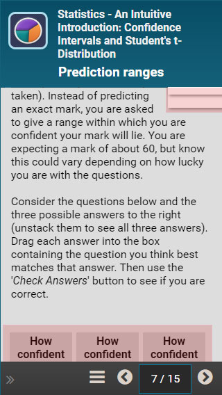
I'm having a difficult time delivering this template on smaller screen sizes, primarily due to the current design, which positions the answer labels tightly in the top-right-hand-corner (absolute positioning) and the droppable areas at the very bottom of the page (see attached).
Throw in some instructional text paragraphs and when viewing on a mobile phone, the large amount of scrolling makes this a very challenging template for anybody to work through. I have a couple of ideas of how to address this, but I didn't want to 'reinvent the wheel' if somebody has already found a workaround?
I know Peter Welch was doing some related work on the 'Fill in the Blank' template, which he exhibited at the recent 2018 Conference?
For what my opinion is worth, I think the text (instructional) area is one of the biggest problems with this template and I've always felt it should be delivered independently above (or below) the drag and drop area, with the labels positioned directly above the droppable and feedback areas, which would then reduce the drag distance to an absolute minimum? The droppable areas would probably benefit from clearing and collapsing down below each other and adopting 100% width on mobile?
Has anybody managed to optimise the Timeline/Matching Pairs XOT template for mobile delivery - specifically for smartphones?
I'm having a difficult time delivering this template on smaller screen sizes, primarily due to the current design, which positions the answer labels tightly in the top-right-hand-corner (absolute positioning) and the droppable areas at the very bottom of the page (see attached).
Throw in some instructional text paragraphs and when viewing on a mobile phone, the large amount of scrolling makes this a very challenging template for anybody to work through. I have a couple of ideas of how to address this, but I didn't want to 'reinvent the wheel' if somebody has already found a workaround?
I know Peter Welch was doing some related work on the 'Fill in the Blank' template, which he exhibited at the recent 2018 Conference?
For what my opinion is worth, I think the text (instructional) area is one of the biggest problems with this template and I've always felt it should be delivered independently above (or below) the drag and drop area, with the labels positioned directly above the droppable and feedback areas, which would then reduce the drag distance to an absolute minimum? The droppable areas would probably benefit from clearing and collapsing down below each other and adopting 100% width on mobile?
Laatst bewerkt 8 jaren 4 weken geleden door Joel-Xhibit.
Graag Inloggen of een account aanmaken deelnemen aan het gesprek.
- Fay
-

- Offline
- Elite lid
-

Minder
Meer
- Berichten: 236
- Ontvangen bedankjes 96
8 jaren 3 weken geleden #5323
door Fay
Beantwoord door Fay in topic Timeline/Matching Pairs template - Mobile
Hi Joel
As far as I know no one has been looking at changing this so if you have time then please do! You're right that Peter has some code that makes the fill in the blank template more workable on mobiles but it's not ready to go in the main code yet (I was going to look at this but haven't had a chance). Perhaps you could contact Peter and see if his code would be suitable for you to use in this template too?
Fay
As far as I know no one has been looking at changing this so if you have time then please do! You're right that Peter has some code that makes the fill in the blank template more workable on mobiles but it's not ready to go in the main code yet (I was going to look at this but haven't had a chance). Perhaps you could contact Peter and see if his code would be suitable for you to use in this template too?
Fay
Graag Inloggen of een account aanmaken deelnemen aan het gesprek.
- Joel-Xhibit
-
Onderwerp Auteur
- Offline
- Nieuw lid
-
Minder
Meer
- Berichten: 11
- Ontvangen bedankjes 1
8 jaren 3 weken geleden - 8 jaren 3 weken geleden #5326
door Joel-Xhibit
Beantwoord door Joel-Xhibit in topic Timeline/Matching Pairs template - Mobile
Hi Fay,
I've been looking into this today a bit more closely and I've managed to use a simple JQuery function which reinserts the instructional text (#textholder) above all of the drag and drop components and this has helped to reduce the amount of dragging/scrolling involved:
I've then written some custom CSS which is executed via a media query when a window width is below 600px (i.e. on mobile phones):
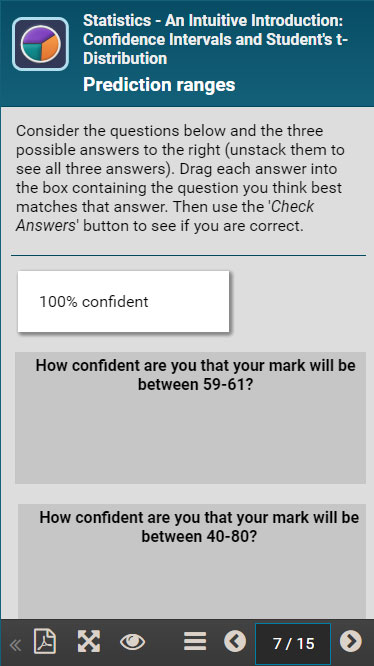
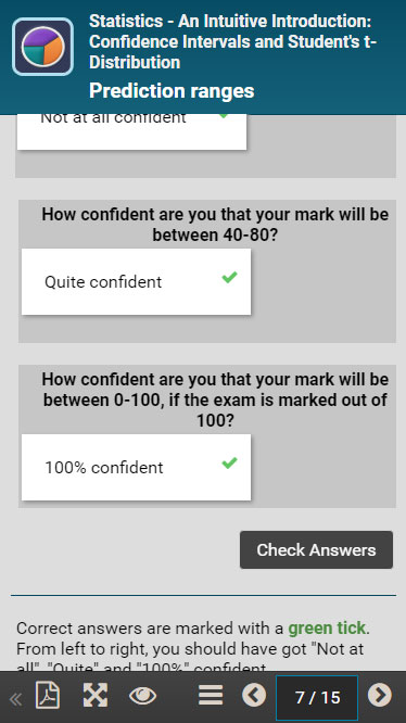
This has resulted in a much better experience on mobile (see attached, below), but the one major issue I'm still trying to overcome is being able to drag my labels downwards (y axis) while also scrolling the main parent div (#dragDropHolder) at the exact same time. At the moment, when dragging a label, once you reach the bottom of the window on a mobile, you can't move it any further and it gets stuck, i.e. the scroll doesn't fire.
I've hit a bit of a brick wall with this one. If we can get this cracked, it would lead to the possibility of being able to drag items down to larger numbers of drop zones. I can't work out whether it is the 'position' or 'overflow' properties on the various components which are causing the scrolling problem or an underlying issue with the way the draggable labels are setup through JQuery?
I've been looking into this today a bit more closely and I've managed to use a simple JQuery function which reinserts the instructional text (#textholder) above all of the drag and drop components and this has helped to reduce the amount of dragging/scrolling involved:
Code:
//Position the instructional text at the very top of the template page, above all the drag and drop components
$("#textHolder").insertBefore("#pageContents");
I've then written some custom CSS which is executed via a media query when a window width is below 600px (i.e. on mobile phones):
Code:
/* Move the feedback text down below the 'Check Answers' button area */
#feedback {
margin-top: 70px;
}
/* Mobile */
@media (max-width:600px) {
/* Reduce the height of the drop landing areas to a minimum */
.target.bg.first.ui-droppable, .target.bg.ui-droppable {
height: 125px !important;
}
/* Extend the drop areas to 100% width of the screen and clear each landing zone on to it's own unique line */
.target.bg.ui-droppable, .target.bg.first.ui-droppable {
width: 100% !important;
display:block;
}
/* Move all the draggable labels to the left of the screen, as opposed to the right */
#labelHolder {
float: left;
}
/* OPTIONAL PROPERTY: You might need to experiment with your own label sizes. This was optimal for my project */
#dragDropHolder .label {
width: 45% !important;
}
}
This has resulted in a much better experience on mobile (see attached, below), but the one major issue I'm still trying to overcome is being able to drag my labels downwards (y axis) while also scrolling the main parent div (#dragDropHolder) at the exact same time. At the moment, when dragging a label, once you reach the bottom of the window on a mobile, you can't move it any further and it gets stuck, i.e. the scroll doesn't fire.
I've hit a bit of a brick wall with this one. If we can get this cracked, it would lead to the possibility of being able to drag items down to larger numbers of drop zones. I can't work out whether it is the 'position' or 'overflow' properties on the various components which are causing the scrolling problem or an underlying issue with the way the draggable labels are setup through JQuery?
Laatst bewerkt 8 jaren 3 weken geleden door Joel-Xhibit.
Graag Inloggen of een account aanmaken deelnemen aan het gesprek.
Moderators: ronm, julten, JohnSmith
Tijd voor maken pagina: 0.162 seconden