Table of Contents
Navigator > Flash Cards
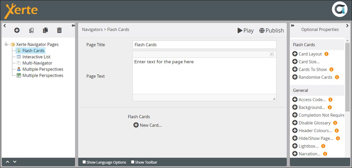
This page presents a series of cards with text on each side, that can be flipped over by learners. They could be used in a variety of contexts, to check understanding or review learning, for example in language learning to review new vocabulary.
Example demo
or view at Xerte Page Types > Navigators: Flash Cards (opens in new tab).
Editor Interface
Top Level: Core Properties
| Property | Description | Type | Additional information |
|---|---|---|---|
| Page Title | Text that appears in header of published page. | Text | |
| Page Text | Content that appears at the top of the page. | Text+ | Use this to give the context or instructions for the task. Other content (e.g. images, audio, video) can be embedded here. |
Top Level: Optional Properties
Page-specific
These relate to the ways in which the cards can be presented. Experiment with the different settings for Layout and Size, depending on the amount of text you are using. and whether you want more than one card to be visible on one screen.
| Property | Description | Type | Tooltip |
|---|---|---|---|
| Card Layout | Options for presenting one or more cards on the same screen {One at a time/In a row/In a column}. | Drop down | |
| Card Size: Width | {Small/Medium/Large/Full}. | Number | Experiment with this if you choose In a row (see above) |
| Card Size: Height | {Fill Space/Fit to Content/Match Tallest Card}. | Experiment with this if you choose In a column (see above) | |
| Cards to Show | Determines the number of cards you want learners to use. This is potentially useful if you have a large bank of cards, but if you only want to present learners with a smaller subset each visit. If you choose Randomise Cards (see below), learners will be presented with a different subset of the bank each time. | Scroll | Default - “1” |
| Randomise Cards | Randomises the order in which cards display. | Tick box | |
| Content Alignment | Sets the alignment of the content on all cards. A 'content alignment' optional property can also be added to individual cards. Options include Horizontal {Left/Centre/Right}, Vertical {Top/Centre/Bottom} and Align Title {checked/notchecked}. | Drop down & Checkbox | New in 3.13. |
General
Top Level: Language Options
| Property | Description | Type | Additional information |
|---|---|---|---|
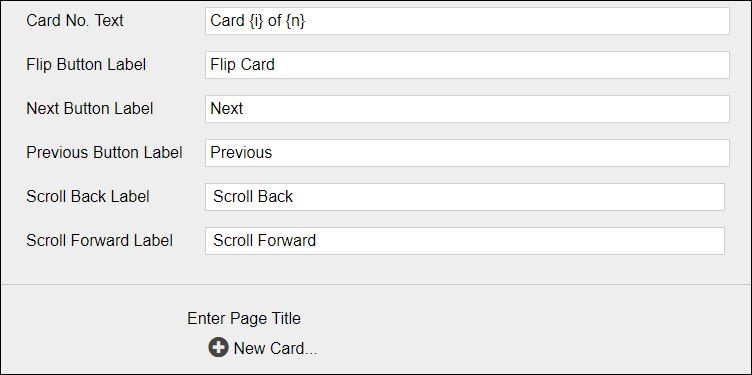
| Card No. Text | Text which indicates which card the learner is using, and where they are in the activity. | Text | Default - “Card {i} of {n}” |
| Flip Button Label | Tooltip on icon for flipping a card. | Text | Default - “Flip Card” |
| Next Button Label | Tooltip on icon to bring up next card. [When card layout is One at a time the Next/Previous labels are used]. | Text | Default - “Next” |
| Previous Button Label | Tooltip on icon to return to previous card. [When card layout is One at a time the Next/Previous labels are used]. | Text | Default - “Previous.” |
| Scroll Back Label | Tooltip on icon to bring up previous card. [When card layout is Horizontal row the scroll Forward/Back labels are used]. | Text | Default - “Scroll Back.” |
| Scroll Forward Label | Tooltip on icon to bring up next card. [When card layout is Horizontal row the scroll Forward/Back labels are used]. | Text | Default - “Scroll Forward” |
When you have created all the settings and language options you need to add a New Card.
New Card: Core Properties
| Property | Description | Type | Tooltip |
|---|---|---|---|
| Title | This appears on both sides of the card. | Text | |
| Slide 1 Text | Text on the first side presented to a learner. | Text+ | Can be text and/or an image. |
| Slide 2 Text | Text on the second side presented to a learner. | Text+ | Can be text and/or an image. |
Further information
There are other page types which can produce a similar pedagogic effect, e.g. Model Answer, Button Sequence, Stimulating question.
In addition, the Flash Cards page type has uses beyond those outlined at the top of this page. It can be used, for example, to present a number of questions to reflect on as preparation for reading, with feedback on the other sides of the cards.

