Table of Contents
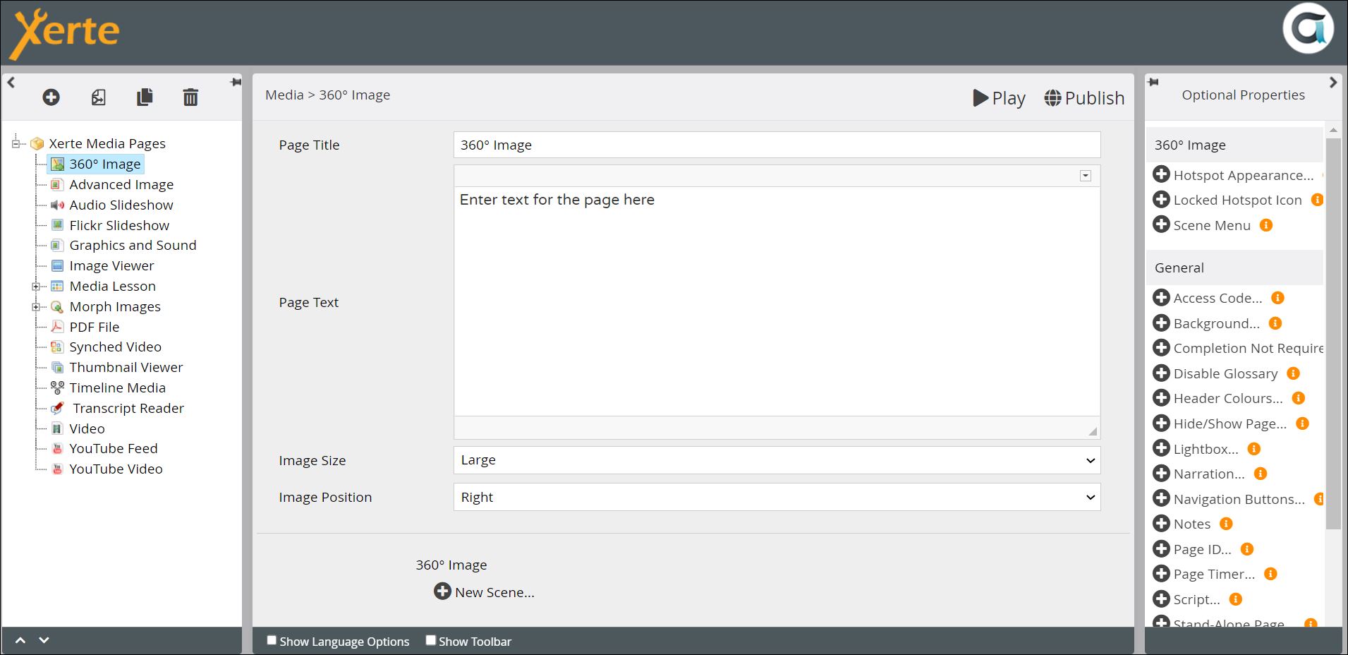
Media > 360º Image
This page presents a 360° image which includes hotspots. If you add Panorama image, you can move around the image by dragging right or left (and if you add a 360° image you can also move up and down. You can also use a Cubemap, if you are familiar with how these work. Hotspots are visible to the learner as circular icons superimposed on the image (see demo below). The hotspots can initiate any of the following;
- a lightbox with further information (text, images)
- a Password, to which a correct answer “unlocks” a further 360° image
- an audio file
- a video file (either uploaded into Xerte, or as an embedded YouTube video)
- links to other Xerte pages.
This page can be used to create learning activities similar to adventure or escape room games. It is, however, a complex page to use and you need to plan it out in advance. 360° images can be taken on most smartphones, but you may have to install an app to do so.
Example demo
or view at Xerte Page Types > Interactivity: 360° Image (opens in new tab).
Editor Interface
Top Level: Core Properties
| Property | Description | Type | Additional information |
|---|---|---|---|
| Page Title | Text that appears in header of published page. | Text | |
| Page Text | Content that appears either to the right or left of the 360° image (see Image Position below). | Text+ (Toolbar) | Use this to give the context or instructions for the task. Other content (e.g. images, audio, video) can be embedded here. |
| Image Size | Determines the size of the image.{Small/Medium/Large/Full} | Drop-down | If you select Full the Page Text will not be displayed to learners. |
| Image Position | Determines the position of the image relative to the Page Text. {Left/Right} | Drop-down | |
Top Level: Optional Properties
Page-specific
| Property | Description | Type | Additional information |
|---|---|---|---|
| Scene Menu | This adds a dropdown menu to enable the learner to navigate through the different Scenes. | Tick box | Locked Scenes do not appear in menus |
| Locked Hotspot Icon | Select an icon to show that the Hotspot has to be unlocked by answering a question or entering a password. | Font Awesome | |
| Hotspot Appearance: Main Colour | Sets the main colour of the Hotspot. | Colour picker | |
| Hotspot Appearance: Secondary Colour | Sets the colour of the Hotspot border and the icon within it. | Colour picker | |
| Hotspot Appearance: Size | The size of the icon and therefore the Hotspot. | Number |
General
Top Level: Language Options
| Property | Description | Type | Additional information |
|---|---|---|---|
| Zoom In | Text in the tooltip that appears on mouseover of the + zoom in icon. | Text | Default - “Zoom in” |
| Zoom Out | Text in the tooltip that appears on mouseover of the - zoom out icon. | Text | Default - “Zoom out” |
| Full Screen | Text in the tooltip that appears on mouseover of the full screen toggle icon. | Text | Default - “Full screen toggle” |
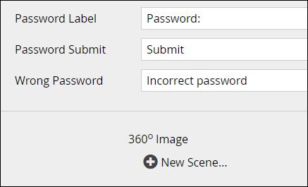
| Password Label | Text beside a text entry box into which the learner enters either a password or the answer to a question (see Lock Hotspot in the Hotspot: Optional Properties below). | Text | Default - “Password:” |
| Password Submit | Text on the button to submit the password or answer. | Text | Default - “Submit” |
| Wrong Password | Feedback to learner if the password or answer is incorrect. | Text | Default - “Incorrect password” |
After you have created the overall properties, go to New Scene, which is where you will add your 360° image.
Scene: Core Properties
| Property | Description | Type | Additional information |
|---|---|---|---|
| Title | A label that appears in the page structure, and can be displayed to the learner at the top of the 360° image | Text | |
| Show Title | Select if you want the learner to see a title for the 360° image | Tick box | |
| Image: File | Upload the image here, through Media Browser | Link to Media Browser | Note that this property is hidden if you select Cubemap Images from Optional Properties |
| Image: Description | Enter a description for Accessibility | Text | Note that this property is hidden if you select Cubemap Images from Optional Properties |
Scene: Optional Properties
| Property | Description | Type | Additional information |
|---|---|---|---|
| Auto-rotate: Rotate | Activates Auto-rotate, where the image starts panning when the learner lands on the page | Tick box | |
| Auto-rotate: Direction | The direction in which the image starts panning {Right/Left} | Drop-down | |
| Auto-rotate: Speed | The higher the number the faster the image moves. | Number wheel | Default - “2” This refers to the number of seconds to make a complete rotation (from 1 - 20). |
| Auto-rotate: Inactivity Delay | By default rotation stops when a learner interacts with the image; this sets the delay (in seconds) when rotation starts again after inactivity. | Number wheel | |
| Compass | Adds a compass in the bottom right corner of the image - “North” is the starting point for the image | Tick box | |
| Cubemap Images: Cubemap | As an alternative to a 360° Image, you can use a Cubemap, which represents a space as the inside of a cube. | Tick box | Unless you are familiar with cubemaps or have a good reason to use one, it may better to use a 360° Image, which will be easier to produce and author with in Xerte. |
| Cubemap Images: Description | Enter a description for accessibility | Text | |
| Cubemap Images: Front/Right/Back/ Left/Top/Bottom | Each image for a face of the cube needs to be added here. | Links to Media Browser | |
| Hide Scene | Enter a description for Accessibility | Tick box | |
| Initial View | Sets the part of the image displayed when the learner lands on the page | Link to tool | |
| Overlay Colours: Tooltips | Sets the background colour of the tooltip that appears on hover over hotspots | Colour Picker | |
| Overlay Colours: | Sets the background colour of the Title Bar displayed at the top of the image | Colour Picker |
There are no Language Options for Scenes.
Next you need to add hotspots to the scene. Click on New Hotspot at the foot of the central pane;
Hotspot: Core Properties
| Property | Description | Type | Additional information |
|---|---|---|---|
| Title | A label or title that appears above the text associated with a hotspot | Text | |
| Edit Hotspot | Add and change the position of the hotspot here | Hotspot editor | |
| Show title as tooltip | Displays Title when the learner hovers over the hotspot | Tick box | |
| Icon | Choose the icon that you want to denote the hotspot | Icon picker | The default is a little bold “i” |
| Orientation | Rotates the icon by the number of degrees enetered. | Number wheel |
Hotspot: Optional Properties
Page-specific
There is a lot of optionality related to hotspots on this page. You will certainly not need to add all the options, and the choice of some of these options precludes the use of others.
| Property | Description | Type | Additional information |
|---|---|---|---|
| External Page: URL | Takes the learner to an external page when the hotspot is clicked on | URL | |
| External Page: Action | {Navigate to page/Open in Lightbox} | Drop-down | |
| External Page: Target | {New Window or Tab/This Window} | Drop-down | This only appears if you choose Navigate to page above. |
| Hide Hotspot: Hide | Hides the hotspot | Tick box | |
| Hide Hotspot: Show on Hover | Reveals the hotspot when when the leaner hovers over its location | Tick box | |
| Hotspot appearance: Main Colour | Sets the background colour of the hotspot | Colour picker | |
| Hotspot appearance: Secondary Colour | Sets the colour of the icon and the outer border of the hotspot | Colour picker | |
| Hotspot appearance: Size | Sets the size of the hotspot | Number | |
| Image: File | Displays an image when the hotspot is clicked on | Link to Media Browser | |
| Image: Description | Enter a description for accessibility | ||
| Lock Hotspot: Lock | Locks the hotspot until another hotspot or scene has been viewed or a password has been entered | Tick box | |
| Lock Hotspot: Hide | Select if you only want the hotspot to be visible after it is unlocked | Tick box | |
| Lock Hotspot: Show Tooltip | Shows the Title as a tooltip when locked | Tick box | |
| Lock Hotspot: Unlock After | {Viewing Scene or Hotspot/Entering Password} | Drop-down | Note that each option reveals a different set of additional properties. Viewing Scene or Hotspot reveals a drop-down of possible destinations; Entering Password reveals a text-entry box for setting up the password, a Case Sensitive tick box, and a text-entry box for password instructions. |
| Move to Page | Select a page that you want the learner taken to when they click on the hotspot | Drop-down | |
| Move to Scene: Scene | Select a scene that you want the learner taken to when the hotspot is clicked on | Drop-down | |
| Move to Scene: Initial View | Choose the section of the image you want the learner to be taken to | Link to Hotspot Editor | |
| Rotate to View… | Rotates the scene to a specific view when the hotspot is clicked on | Link to Hotspot Editor | |
| Sound: File | Shows an audio player (or auto-plays sound) when the hotspot is clicked on. Add link to audio file here. | Link to Media Browser | |
| Sound: Type | {Audio player/Auto-play} | Drop-down | |
| Sound: Start Time | Start playing from this point in the recording (seconds in). | Number | |
| Sound: End time | Stop playing at this point in the recording (seconds in) | Number | |
| Text | Text/HTML displayed when the learner clicks on the hotspot | Text+ (Toolbar) | |
| Video: File | Shows a video player when the hotspot is clicked on. Add link to the video file here. | Link to Media Browser | |
| Video: Description | Enter a description for accessibility | Text | |
| Video: Start Time | Start playing from this point in the recording (seconds in) | Number | |
| Video: End Time | Stop playing at this point in the recording (seconds in) | Number |
There are no Language Options for Hotspots.


