Table of Contents
Interactivity > Hotspot Image
This page presents an image which includes hotspots. When the learner clicks on a hotspot, some text is revealed, either in the left panel or below the image. Alternatively the learner can click on the forward and backward arrows to move systematically through the hotspots.
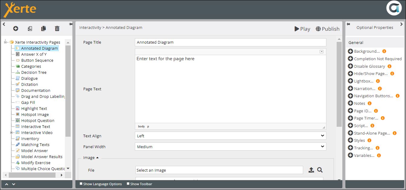
The Annotated Diagram page is similar, but in this a list of labels is presented beside or below the image. When the learner clicks on one of these labels, or on a hotspot in the image, a connection is made between the label and the hotspot.
Example demo
or view at Xerte Page Types > Interactivity: Hotspot Image (opens in new tab).
Editor Interface
Top Level: Core Properties
| Property | Description | Type | Additional information |
|---|---|---|---|
| Page Title | Text that appears in header of published page | Text | |
| Page Text | Content that appears at the top of the page | Text+(Toolbar) | Use this to give the context or instructions for the task. Other content (e.g. images, audio, video) can be embedded here. |
| Align Text | Puts all the text in either the left or right panel {Left/Right} | Drop-down | |
| Image: File | Adds the image (through XOT Media Browser) | Link to Media Browser | Click on the upload icon, import the image into Media Browser, and click on the thumbnail to add here. |
| Image: Description | Adds a description for accessibility | Text | |
| Show Highlight | Shows all the hotspots with a highlighted boundary | Tick box | |
| Interactivity | Two options for interactivity {Show Me/Click Explore} | Drop-down | There is little difference between the two options. Both allow the learner to click on hotspots at will, but Show Me also offers < and > arrows enabling the learner to work through the hotspots systematically. |
Top Level: Optional Properties
Page-specific
These all relate to the appearance of the Hotspot highlight.
| Property | Description | Type | Additional information |
|---|---|---|---|
| Stroke colour | The colour of the edges of the hotspot. This appears only on mouseover. | Colour picker | |
| Stroke opacity | The opacity (a decimal number between 0 and 1) of the edges of the hotspot | Number | |
| Stroke width | Width of the edges of the hotspot | Number | |
| Fill hotspot | If selected the hotspot remains filled with colour until the next hotspot is selected | Tick box | |
| Fill colour | The colour of the fill | Colour picker | |
| Fill opacity | The opacity (a decimal number between 0 and 1) of the fill. | Number | |
| Show tooltip | If selected, a tooltip appears on mouseover of a hotspot. The text in the tooltip is the Title of that hotspot. | Tick box |
General
Top Level: Language Options
| Property | Description | Type | Additional information |
|---|---|---|---|
| Next Arrow Label | Text in the tooltip that appears on mouseover of the > arrow in Show Me format. | Text | Default - “Next” |
| Prior Arrow Label | Text in the tooltip that appears on mouseover of the < arrow in Show Me format. | Text | Default - “Previous” |
After you have created the settings and added the image, go to New Hotspot .
Hotspot: Core Properties
| Property | Description | Type | Additional information |
|---|---|---|---|
| Title | A label or title that appears above the text associated with a hotspot | Text | |
| Edit Hotspot | Add and change the shape of the hotspot here | Hotspot editor | |
| Text | The text that is revealed after the hotspot (or the navigation arrow) has been clicked on. | Text+ (Toolbar) |
There is only one Optional Property for hotspots. Tooltip Description allows you to enter a description for accessibility, which is displayed on mouseover. There are no Language Options for hotspots.

