Table of Contents
Interactivity > Model Answer (3.15 version)
A page that presents the learner with a box into which text can be typed, in response to an instruction or question. The user clicks on a Check Button, which reveals a model answer, for comparison with the learner's text.
In 3.14 and earlier releases it was only possible to place one text-entry box on the page. If you are running one of these releases you need to refer to this wiki page. From 3.15 onwards it became possible to place multiple boxes on the page. Separate feedback can be written for each box, and when the learner submits responses the feedback is displayed after the box with which it is associated. You can also add feedback that relates to the whole sequences of prompts and responses.
There is also a 3.15 version of Model Answer Results, which displays content and responses from all or some of the Model Answer pages in your project.
Example demo
or view at Xerte Page Types > Interactivity: Model Answer (opens in new tab).
Editor Interface
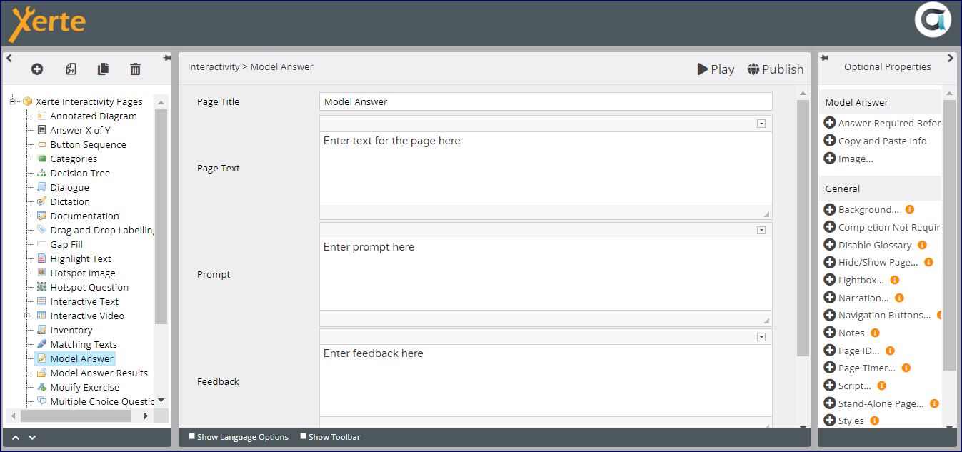
Core Properties
| Property | Description | Type | Additional information |
|---|---|---|---|
| Page Title | Text that appears in header of published page. | Text | |
| Page Text | Content that appears in the left pane or at the top of the page. | Text+ (Toolbar) | Use this to give the context or instructions for the task. Other content (e.g. images, audio, video) can be embedded here. |
| Feedback | Feedback revealed after hitting Feedback button. | Text+ (Toolbar) | |
| Panel width | {Small/Medium/Large/Full} Dimension of the right panel (gapped text). | Drop-down | Full puts the Page Text above the gapped text. Experiment with this setting to take account of dimensions of content in each panel. |
| Align Text | {Left/Right} Position the page text on the left or right side. | Drop-down |
Now you need to add a prompt, a text-entry box and any feedback you want to have associated with that box.

Text Area: Core Properties
| Property | Sub-property | Description | Type | Additional information | |
| Label | The label is used to identify this text area on the results page and when tracking results, e.g. via SCORM/LTI/xAPI. | Text | |||
| Prompt | The question or prompt shown before the associated text field. | Text+ (Toolbar) | This is typically an instruction or a question that the user answers by typing into the text entry box. | ||
| No. of Lines | The number of lines in the text entry box. | Number | |||
| Image: | File | Select any image you want to display with the text area. | Media browser | Image appears above the text box that learners type into. There are no image resizing or relocation options. | |
| Description | Enter a description for accessibility. | Text | |||
| Caption | Add an optional caption below the image. | Text | |||
Optional Properties
Page-specific
| Property | Sub-property | Description | Type | Additional information |
|---|---|---|---|---|
| Mark Answer | Select this option to enable tracking of the score weight. | Checkbox | ||
| Copy Button | Clicking the button allows users to easily select and copy their responses. | Checkbox | ||
| Download Button: | Include button | Select to make button appear on the page that will allow learners to download their responses. | Checkbox | |
| Filename (without extension) | Gives the option to rename the file download. {model_answer} | Text | |
|
| File orientation | Gives the option to display in portrait or landscape {Portrait/Landscape) | Drop-down | ||
| Require Answer | When selected this requires that all text entry boxes on the page must have content before answers can be submitted. For the user the check button is greyed out, and only becomes active when the user types into the text box. | Checkbox | ||
| Tracking Score Weight | Customise the weight of the task on this page, relative to other scored pages in the project. Setting the weight to 0 will mean that the task on this page will not contribute to the project's overall score. | Number | ||
General
See General Optional Properties
Language Options
Most of the Language Options for this page relate to the copy and download feature.
| Property | Description | Type | Additional information |
|---|---|---|---|
| Page Text | {Page} | Text | |
| Question Text | Customise the heading for displaying before each question. {Question} | Text | |
| Response Text | Customise the heading for displaying before each response. {Your response:} | Text | |
| No Answer Text | Customise the text for displaying when no response was submitted. {No response submitted} | Text | |
| Feedback Text | Customise the heading for displaying before each feedback comment. {Feedback:} | Text | |
| Main Feedback Text | Customise the heading for displaying before the overall page feedback. {Page feedback} | Text | |
| Check Button Label | Text on the button that reveals the model answer. {Submit} | Text | |
| Copy Button Label | Customise the Copy button. {Copy} | Text | |
| Copy Shortcut Text | Customise the shortcut text. {Press Ctrl+C to copy} | Text | |
| Download Button Label | Customise the Download button. {Download} | Text | |
| Answer Field Hidden Aria-Label | Hidden label for screen reader so that the text entry is labelled and spoken to the user. {Answer} | Text | There is a Tooltip for this. |
Further information
This page can be tracked.
The learner can complete the task and download their response and the feedback, similar to the Documentation page. This generates a Word document as output, without the learner having to separately copy and paste into a document.
You may want to make a clearer distinction between the text provided in the task (i.e. the Prompt and Feedback) and the learner's response, by using italics or a different font for the Prompt and Feedback.
{{tag>pagetype interactivity}}